-
Evening all! It’s website week on the Catapult course and we’re looking forward to seeing some messy first version websites tomorrow. I thought I’d open up a post to the whole community and ask for you to share your website and your most pressing question?
Would you like feedback on your copy? headline?
Do you want people to check how it looks on different browsers?
Would you like people to read your WHY and share what they feel?
45 Comments-

Also, I know our Graduates have created some wonderful sites – feel free to share your current or WIP ones here! Have you still got any lingering questions about your websites?!
Conrad Young Caroline Murray Bansi Shah Caoimhe Kelly Janis Chan Kevin Withane Mark Cliffe Natalie Tucker Pete Domican Carolin Greiner Steve Hampson Pavitter Mainn Philipp von Bieberstein Tracey Rob Perera Ruth Walker Jacob McPherson Javier Garcia-Ramos Glenda Fox Heather Sharp Bernice Joan Langley Saira Chaudry Drummond Gilbert Eike Post Paul David Mather Matt Ward Silvia Janska Nicola Twiston Davies Regina Dundelova Adam Park Lynne Williams Hannah D'Souza Julia Poncar Becky Fishman Ann-Kathrin Dobre Santi Ureta Malcolm Millar Jason Barlow Lara Hayward Nick Laurance Tim Walters, Ph.D. Alexandra Goldschmidt Adasat Baute Kathryn Wehner Monsuru Sodeeq Simon Hurst Ian Carrington Akinwande Andy Dougan Anuraag Jain Daisy Meakin Damien David Fulton Frederick Leuschner Ginnie Dallard grace olson-davidson Harpreet Sharma Hermeet Gill James Bebbington Jeff Jones Lizzie Bourne Mahdi Shariff Marcus van der Gaag Nahush Krishna Nrinder Prashant Singh Rebecca Claire Graves Rebecca Beck Robina Sutch Ice White Duncan Dalzel-Job
-
-
Hey Sodeeq, this is a great first step and it’s wonderful to see how you’re working with Riyike too! I’d suggest that the more information about each of your services would be great to have ”below the fold” on your homepage so that users can get to know what you offer quickly. Once this, your blog and your contact us pages are in place then you’ll have the framework to launch with and build from. At a later date I’d love to see some testimonials too or an illustration of who you’ve worked/are working with. I hope this helps some!
-

Monsuru Sodeeq I think a picture of you and the mention that you are currently writing a book would be good additions!
-

Thank you, Laura. I appreciate you.
-
-
-
-
I love the Flying Start concept and the clean clear approach you have with the single page site. The spots of colour along the side work really well (but watch the blue one because it cuts off when Flying Start comes in), but my favourite bit is the merging of creation, development, creation etc in the initial section.
-

Great website Conrad Young as we discussed in Catapult. I like the composition of the spacing now. One thing that is still missing for me is the CTA to ”learn more” above your fold – where it can take me to schedule a call/demo. Good way for you to capture your leads earlier on.
-
Conrad Young smart site! I like. However when I click on a face it takes me to social not to book a call. And then when I realised I could click learn more I also couldn’t straight away book a call. Also, do you need all three of you at that front end for new enquiries?
-

Hi Conrad Young. Your site looks great and is very slick and smooth to navigate. I think it communicates your services and ethos very clearly. I found that it didn’t open up an option to contact you when I clicked the faces or ”Schedule a call” at the bottom.
-

Thanks for the feedback Natalie 🙂 Schedule a call definitely needs to be fixed you’re right. Will be getting on that soon!
-
-

Hi Conrad Young – site still looks great! I like the clarity through simplicity. Know it’s still evolving as you had mentioned you were adding all your own links etc. I still prefer the mobile scrolling to desktop scrolling, possibly because it’s one column so it flows through each of you and therefore mirroring your service process? Great work either way

-
Cheers for the feedback Janis. Interesting to hear that mobile is preferred, my cofounder is on team mobile while I’m defo for desktop. Will be good for him to hear he has support 🙂
-
We’re starting to take more of a ”mobile first” approach with the changes we make to our site and the platform, so this is interesting to read Conrad Young Janis Chan!
-
I wont lie Lexi Radcliffe-Hart, mobile focus is definitely the way to go. I’m just a sucker for desktop (probably because my smartphone is so small haha)
-
Hazards of previously looking at web design, I am always pro responsiveness and at the time React but times have moved on! What smart phone do you have that is small?! Conrad Young
-
Haha, it’s an iPhone SE Janis Chan. Got it free from my last time full time gig and haven’t been pushed to replace it yet
-
-
-

Great site Conrad, it is very professional, tells me very concisely what you do, and does what it says on the tin. ! However needs some tidying up..
The call to action is confusing, I tried to ”click on a face”, and all it did was present me with a set of icons, would be great to have a ”Hi I am …. what can I do for you ?” Together with a short bio and a message ”would you like to arrange a call, etc’.” after which I am presented with. a calendar…
Again the same comment on the bottom where it says ”schedule a call”
You have put some customer names on the site, it would be great if when the name was selected there was an endorsement behind it.
I don’t see any case studies..?
Hope this helps
Damien
-
Hi Damien, all very good points – thanks very much for your feedback. We are in the process of adding in case studies and will be fixing the call buttons shortly. Endorsements behind the names is a great idea also!
-
-
-

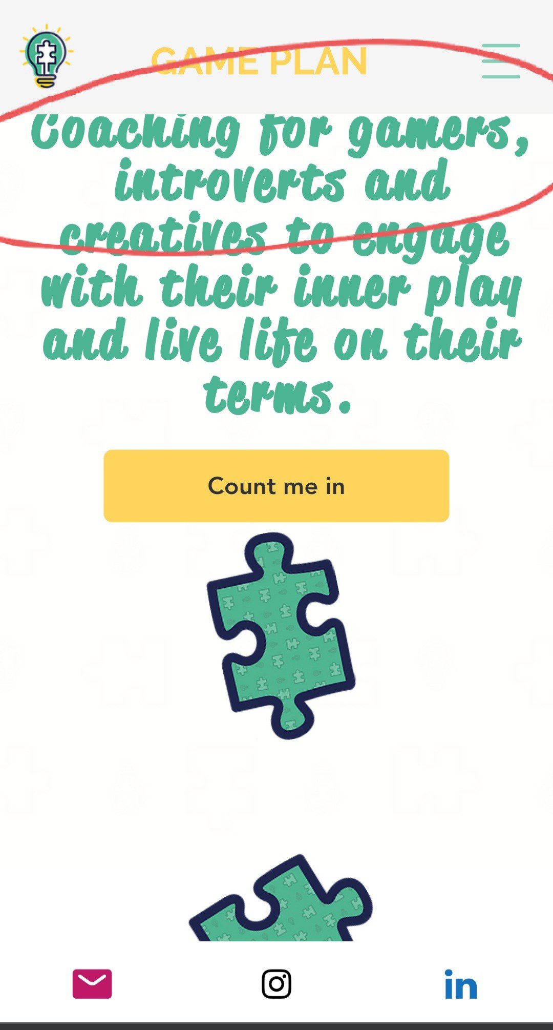
Thanks so much Lexi Radcliffe-Hart – you can find me on http://www.gameplanlifecoaching.com and would love to see you all there and feedback gladly welcomed, it’s a constant work in progress 🙂
-
The site is really well constructed and full of useful information (and great SEO juice I’m sure!) – but the bit that made me the happiest to see – your story, and the values you play by – such a great way to show it and I can see how you’re reflecting your brand style between socials and your site now – interconnected storytelling at its best!
-
Wow – great to see so many changes (and improvements) from your first site launch Nicola Twiston Davies, goes to show how websites are always an iterative process. Love seeing the testimonials on the homepage. This is a very personal preference but I like the copy above the fold (before you scroll) to be punchy and minimal. Where it tells me what the service is quicker and if I am interested then I will scroll to get more info.
-
You’re so right Fiona, it’s changed alot! That first line has been trouble for me as I totally agree with you, I’ll add it to my to do list 🙂
-
-
Fab website @nicola. For me, and this is tiny, the home page and the logo are close and sometimes overlap on my window which just unsettled me! About page story is great but I did find myself wanting a little bit more detail on your background. But that might be personal preference.
-
Thanks Laura, I used to have detail on my background and I thought I’d switch it up with this but I agree, I want to add a bit more to it in terms of achievements etc so thank you for the nudge and the formatting point too!
-
-
Hi Nicola Twiston Davies – I love your site and your concept! I particularly like how the tone and design really show your personality and unique offer. One very small thing I noticed when scrolling through was that the first part feels very personal – it speaks to how you can help individuals. Seeing the quotes with logos directly underneath jarred with this slightly for me. I completely understand why you’d want to put those up front, but I wonder what difference it would make to swap the quotes you have attributed to people, with those attributed to organisations? As I said, it’s a very small thing, and just my personal reaction reading it as an individual not an org!
-
subtle, thanks Natalie Tucker I see your point! I will swap for sure 🙂
-
-
Hi Nicola Twiston Davies – I love your story, site and concept too! Definitely shows your self brand. Similar to Laura – on the mobile site, the logo overlaps the top bar (fine on the web version). On the same line of thought as Natalie but depends on who your target is, wondering if you favour individuals over organisations or vice versa? For me as an individual it works but if I was looking in my previous role in corporate, it would not hit me straight away that team building is core as it’s listed under ”workshops”. Also the word ”book” for me also perceived as info about your book – I honestly wanted to read about your book! But all minor – different perceptions!
-
Thanks Janis Chan, I really appreciate you taking the time, I can see the team building/workshop part isn’t so clear. May I ask what phone you use as I’m on an android and I’m not seeing the logo problems on the header! I’m going to add ’write a book’ onto my to do list 🙂 thank you!
-
Hey Nicola Twiston Davies, I have an android phone – Samsung (but I work on a mac and PC!). Attached view on my mobile for you – it’s minor and think you may have changed that landing page so the jigsaw piece isn’t at the top anymore? Doesn’t everyone want to write a book!

-
-
-
Hey Nicola Twiston Davies – really love this site. It’s got such a warm personality to it and flows really nicely. What website builder did you use for it? I’m personally a sucker for CTAs that have some zing. I wonder if there’s a way you could style ’book a free call’ to align with the character of your site?
-
Hi Conrad Young – thanks for the feedback and really pleased to hear you like it 🙂 I built it all on Wix! Agree on the CTA, I had ’build your plan’ before but would definitely like something more playful although I also didn’t want the message to get lost. Will gladly welcome suggestions!
I had a look at yours, I really like it too, especially the rolling hero image words at the top. Not sure if it’s been said but the icons on the images to get in contact aren’t linked to the social sites. Also, when I scrolled down to the bottom the ’Let’s work together, Schedule a call’ isn’t consistent. There’s no button after it on the home page so it’s hard to know how to scehdule a call and when scrolled to the bottom and I clicked on the arrow of one of your profile pages, it took me to the blog, not to a call booking page!
-
-
-
Hi all, hope I’m not too late to the party on this one, and thanks for the prompt Laura Thomas and Lexi Radcliffe-Hart. I’ve finally got round to updating my website, following some really useful feedback from my cohort. Would love some thoughts on the latest version (which is a constant work in progress!): https://fledgeconsultancy.com/
-
hi Natalie, big fan of the simplicity of your site, it feels lovely. Mine is mainly formating – the alignment of the ’Consultancy’ and ’Capacity building’ plus the ’Case Study’ button don’t flow so well . Can you centre the button or perhaps give a background to the Consultancy and capacity building descriptions
?
-
Great idea re background for that part, I’ll definitely play around with the formatting. Thanks so much for taking the time to look Nicola Twiston Davies
-
-

Hi Natalie! I agree with Nicola, I love the simplicity and clarity of your site, and your choice of colour, the orange plays beautifully on the white space and really speaks to potential and growth. that said I think you could do more with your birds in places to connect the different sections, not necessarily a full background as such but maybe just dropped in here and there to help the flow and connectivity. But that may just be me – I love birds 🙂
-
Thank you Caoimhe Kelly, so helpful to get some more creative eyes on my site 🙂 Will see what I can do with the birds!
-
-
Never too late Natalie Tucker! One thing from me, if you can ”fix” the top menu so that when you scroll you can still access the menu points in a desktop browser. Really love the white space and clarity the site brings.
-
-
-

Hello! Here’s my website – would love some feedback http://www.allscrubbedupscrubhats.com – work in progress!
-
Hi Laura! I love your brand and the work that you’re doing! Your site is clear and easy to navigate. You’ve got so much useful information and a real community feel in your gallery and sustainability pages, I loved that! I actually would love to see one or 2 of your gallery photos on your landing page rather than the mannequin head – you’ve got so many wonderful pictures of people – and you – wearing and enjoying your product, I really think you could lead with that – spread the joy!!
-
Thanks so much Caoimhe! Appreciate your feedback 🙂
-
-
Totally going to follow on from Caoimhe Kelly’s feedback – it’s great to see the gallery photos on the landing page. I also really like the CTA of ”I need a scrub hat in my life”. Watch out for the missing footer on your About Us page by the way!
-


Oo nice question Laura Thomas!
Tagging this with our current cohort after an excellent session sharing our thoughts today – I’d personally love to see what you’re working on and what’s your most pressing challenge/question as Laura says! Sophie Mitchell-Heggs Anastasia Trifonoff Deepshikha Yadav @peter-fayle Yasmin Gregory Fay Edwards Roger Holdom Sehr Tejpar Lorenzo Espinosa Emily Anderson